Colour is a fundamental element in architecture and design, powerfully shaping our perception and emotional response within a space.
At Nick Leith-Smith Architecture + Design, we are always seeking to harness the profound impact that colour has on mood, behaviour, and the overall experience of inhabiting a built environment.
In this article, we delve into the fascinating world of colour psychology and examine its application in a notable office project from our portfolio
The Emotional Spectrum of Colour
Warm and cool hues play pivotal roles in evoking emotions and setting the tone for a space. From the fiery passion of red to the calming embrace of blue, each colour carries its own psychological significance, influencing how we perceive and interact with our surroundings.
Understanding the emotional resonance of colour allows us to create spaces that cater to diverse needs and experiences. By strategically integrating warm and cool tones, we can craft environments that evoke a range of emotions, from excitement and comfort to balance and focus.
Colour and Space Perception
In addition to influencing emotions, colour also affects our perception of space. Lighter hues can create an illusion of openness and expansiveness, while darker tones impart a sense of intimacy and cosiness. By manipulating the interplay of light and colour, we can enhance the spatial dynamics of a room, maximising its potential and functionality.
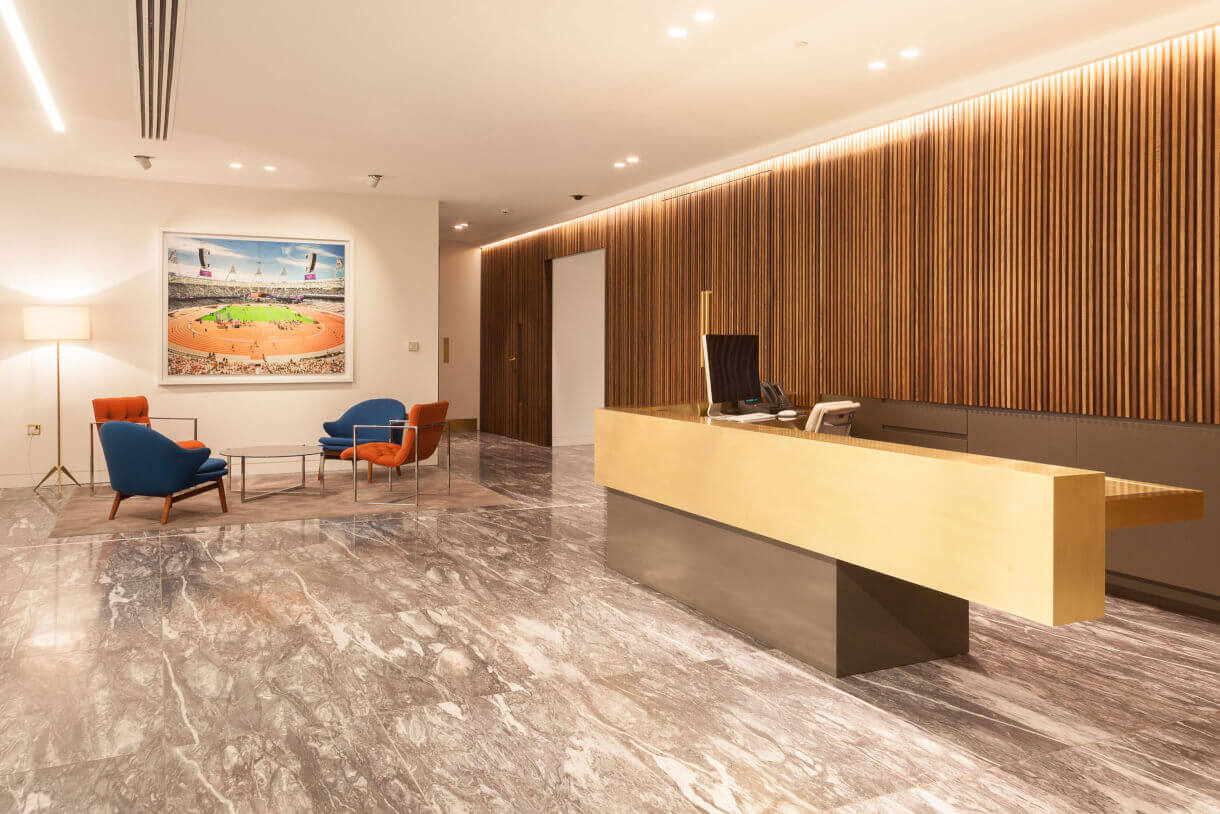
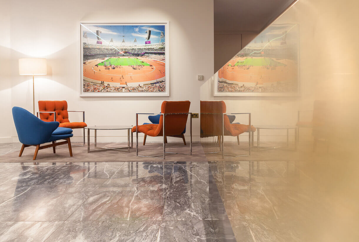
Case Study: Office Design for a Private Equity Firm on Pall Mall
One of our earlier projects at Nick Leith-Smith Architecture + Design involved crafting an office space for a young private equity firm situated on Pall Mall. Inspired by the pioneering design ethos of American post-war mid-century aesthetics, we curated an environment rich in bold forms and natural materials, echoing the firm’s ethos of dynamic ambition.
Every material and furnishing choice was made with colour at the forefront of our design considerations. Each element served a dual purpose: to seamlessly blend with the architectural vision and to evoke specific emotions resonant with the firm’s DNA. From the warm, inviting wooden tones, to the vibrant accents in the upholstery and artwork, each detail contributed to a carefully curated colour palette.
In the lobby, oak slats lining the walls were stained in various shades, establishing a subtle yet tactile background texture. This was complemented by seamless slatted meeting room doors adorned with custom brass handles.
Spot colours were strategically introduced throughout the upholstery and artwork, including in the reupholstered mid-century seating in vibrant blue and orange hopsack weave. The centrepiece, ‘Stadia XIV’ by photographer Marcus Lyons, depicted the 2012 Paralympic Games, adding a powerful and colourful narrative layer to the overall aesthetic.
Incorporating Colour Theory into Design Practice
At Nick Leith-Smith Architecture + Design, we approach colour selection with a keen understanding of colour theory and its impact on spatial design. By carefully considering the emotional and perceptual effects of colour, we craft environments that not only look beautiful but also resonate deeply with their occupants.